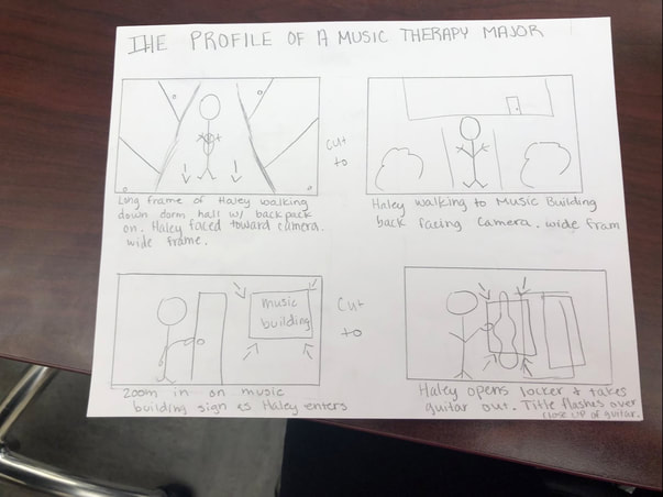
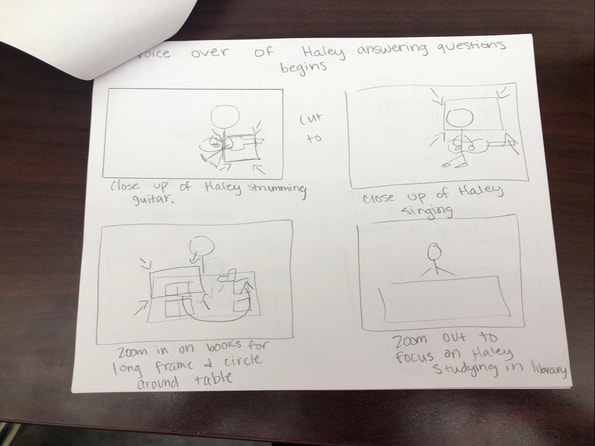
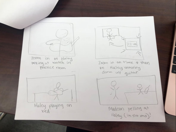
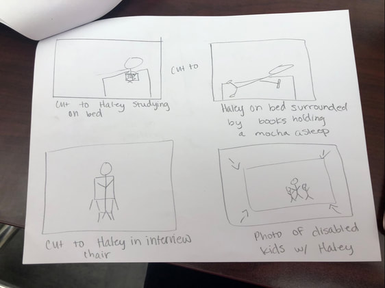
|
On August 27th, 2017, Kenneth L. Storey, a sociology professor at the University of Tampa, tweeted "I don't believe in instant Karma but this kinds feels like it for Texas. Hopefully this will help them realize the GOP doesn't care about them." This tweet suggested that Hurricane Harvey, a natural disaster that devastated Texas along with other states during late 2017, was "karma" for Texas for voting Republican. Due to the sensitivity of the topic, Storey was shamed for this tweet for many reasons. The first reason for this communication breakdown was Storey's audience. He intended for the tweet to be liked and responded to by Democrats, like himself, who were angry about the 2016 election results. Unfortunately for him, Twitter is not a filtered audience so everyone saw his tweet, not just those who would agree with him. The next couple reasons this communication broke down is because of Storey's purpose and context. Storey meant to get a laugh out of his left-leaning audience which in of itself isn't a problem. People make fun of those who voted for Trump all the time, calling them crazy or by just straight bashing them. Storey's main problem lies in his context. Everyone was appalled that he would make a political joke about a devastating storm in which people were losing their homes and their lives. Such a joke can easily be seen as insensitive and cruel. Now, the real question for Storey's situation is: Can communication be restored? In my opinion, yes it can, but only if it is dealt with in a timely manner. If Storey had noticed the first general reaction within, say, an hour of posting, and deleted the tweet and left an apology, there may have been hope to save his reputation and to avoid having this tweet go viral. Besides this scenario I've thought of, there would have been no real way to undo the damage Storey did to himself. In all, this situation reminds me of a viral tweet analyzed in chapter four of Jon Ronson's "So You've Been Publicly Shamed." In the chapter "God That Was Awesome," a women named Justine Sacco tweeted, "Going to Africa. Hope I don't get AIDS. Just kidding. I'm white!" After she tweeted, she boarded an 11-hour flight, ignorant to the backlash her tweet received. Now, Sacco and Storey's situations are very similar but also very different. For one, they both posted their scandalous material on the same platform, Twitter. This media platform allows you to post very brief, 140 characters or less, posts of the first things that come to your mind. This can prove to be very entertaining, but also very dangerous for certain users. Now, to be fair to Sacco, before I go into her and Storey's other similarities, I must highlight their main difference. It was revealed after the onslaught Sacco received that she posted her joke as a means to bring awareness to the ignorant belief that some white people have that they will not receive AIDS simply because they are white. Although extremely misguided, she had somewhat good intentions. Storey, on the other hand, was joking about people deserving to lose their homes and lives simply because of their political beliefs. I can see no bigger purpose behind Storey's thoughtless words besides wanting to get a laugh. Sacco and Storey are also different due to Sacco not seeing the effects of her tweet until 11-hours after it was posted due to her being on a flight. Storey could have stopped the backlash, as I have said, by erasing the tweet immediately after seeing the negative responses and publishing an apology shortly afterwards. Sacco's fate, on the other hand, was sealed as soon as she clicked post. The final similarity between the two situations was the aftermath. After seeing the damage being done to their reputations, both Sacco and Storey erased their original tweets and published a public apology. Unfortunately, in both cases, it was too late. Both parties lost their jobs due to public outrage. No apology could undo what they said. This goes to show that once you put something online, it's out there forever and you can never take it back. 
0 Comments
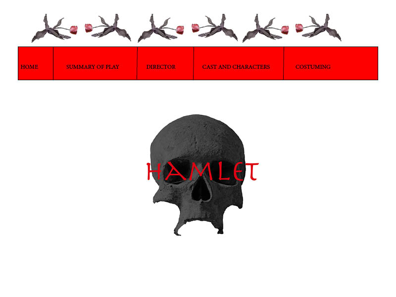
The first thing I focused on for this assignment was the logo. I wanted the logo to be instantly recognizable and to sum up how dark and iconic Hamlet is. I originally wanted to showcase how unique the Nashville Archive's performance was by using the statement piece of Hamlet's madness as the background of the logo, but eventually decided against it as it was too difficult to photoshop and made the logo look messy. Instead, I used the iconic image of a skull for the background but added a twist to it. I used an image of a skull made of stone, photoshopped to be darker, so it would look similar to the unique mass. I then wrote Hamlet in an ancient looking font with dark, ruby red coloring. This gives the play a dark, intriguing tone to the audience. The skull, besides representing Hamlet's mask of madness, also represents the death to come in the show, both from ghosts and murder. I chose the ruby coloring to represent blood and to highlight the jeweled color scheme the costumer for the show was going for. For the actual site, I chose a red coloring to draw the audience's eye, and keep the dark theme going. Along with this, on every page I outlined the top with dying flowers. I did this because I was reminded on our guests telling us that the dead flowers were such an iconic symbol of Ophelia and I wanted to illustrate that somehow. Plus, it adds a sense of foreboding to the site as a whole. Since our site while generally be used by people who either know a lot about Shakespeare and those who know nothing at all, I was very specific with the pages on the site. I thought a small summary of the plot was a must as Hamlet itself is confusing and this production's unique features should be explained as well. I then had a section for the Director, I think the Director's interview speaks for itself, so I thought that page should just be the video. Next, I had the Cast and Characters page. I thought we should have photos of the actors along side an explanation of the actor's and the complex characters they play. The last page I thought we should have was Costuming. I think we should have the costumer interview on this page above photos of photoshopped images of the costumes to showcase the costumes themselves instead of the actors. The reason my site idea should be chosen is because it highlight's Hamlet's uniqueness as a show, its intriguing darkness, it is user friendly, and helps explain the show in full.
I wish that I could say that I created my website from scratch, but that would be a lie. I used the template simplestyle_purple from https://www.html5webtemplates.co.uk/templates.html to create my website. One of the first things I did was access all the html pages for all of the pages on my sight and changed the logo from simplestyle_purple: Simple. Contemporary. Website Template. to Maddie Glanton: My Introductory Website. A challenge I faced with this was when I originally didn't realize that I had to change the logo on ALL of the html pages, not just my home page. I also had to do this with my social media accounts section and the link to my Weebly website. The next thing I did was change the existing links that just led back to my home page into links to my social media accounts. At first, I was wracking my brain to remember how to type out a link in code, but then I had a aha moment. I copied the urls of my accounts and put them in between the quotation marks in <li><a href="">Name of Social Media</a></li> and voila! I had links to my social media accounts and Weebky website on every page. I then had the challenge of changing the names of the tabs, which ending up being very simple. I kept the original html tag, for example index.html, and changed the appearance name like index to Home. From there, I started typing information on the Home page and I was fine until I tried to make certain words links to the only website pages. I used the same link procedure as I had with the social media accounts, but I couldn't get one to come out the way I wanted it too. Luckily, I realized that at the end of my link coding I had switched the a and the backslash where it looked like <a/> instead of </a>. I fixed the mistake and everything turned out the way I wanted it too. The thing I had the biggest problem with when creating my website was pictures. The collage of myself on the home page was no problem as I made it the same size as the first banner picture and just switched the .jpg in the coding. The photos on the Summary of Me page were a whole other story. At first, one of the pictures was just not showing up, which ended up being because I forgot to put style/ in front of the .jpg. Then the picture of my family ended up being too small when resized to fit the original so I reverted it back to the bigger size, which fit perfectly. The photo I had the worst trouble with was the photo of my pets. No matter what I did, the photo kept getting cut off. I eventually solved the problem by resizing it over and over until it fit. It took a while. I then typed up the rest of my website. This involved using a header 2 code and the <strong> code to bold words. I then moved onto my changes of the style sheet. Using the W3Schools website, I picked the colors for my header, footer and border. I changed the light purple header and footer of the original template into a nice blue ranging on purple. I then changed the color of the borders from a dark purple into a light pink. I then found myself unsatisfied with the thickness of the header and footer borders and decided to make them thicker. The original thickness was 2px and now the thickness is 10px. I then realized the second color of my logo, which was dark purple, no longer matched the theme of my website. I changed the second color to light pinking, keeping the first color white. Along with this, I changed headers 1, 2, 3, 4, 5, and 6 to be the same blue color as the header and footer. The last two things I changed on the style sheet were the font of the logo from Arial to Brush Script MT and the menu hover color from dark purple to light pink. I think over all my website fits my image of my ideal website, except for a few minor details. In my ideal website, I would have had a picture below "Have fun exploring!! :)" on the home page. I would have also had pictures of my hobbies and favorite things respectively on the Hobbies and Favorites page. I would have also liked a picture next to my "logo" (my name). Besides that, I feel like this website is pretty close to what I imagined. As for design strategies, I used a lot. I put emphasis on my titles and answers to what my favorite things were, hoping the boldness would draw the audience's eyes and cause them to click on them to know more. For color, I used a calm blue and pretty pink to give my website a calm, friendly feel that makes the audience happy when they look at it. In terms of organization, I tried to make my website user friendly by giving the audience an explanation of the website on the Home page and gave the audience links to everything so they won't get confused. In terms of proximity, I tried to keep everything close, but not squished so that the audience would not feel contained to much and so that the could still find everything easily. Over all, I hope my website is perceived as pretty, user friendly, and fun to be on.
I analyzed the Globe to Globe Hamlet website. It is a very well designed website. The first thing I noticed on the home page is the color. The important terms and titles are black and white, but as soon as you scroll over them, they turn red. This is a great use of color because it draws the eye but I think it would have been better if the words had started out as a brighter color. The pictures in the background are very interesting and creative, but draw the eye away from the important information and links on the site. The organization of the site is very confusing. It is not clear for certain pages what they are presenting to the audience. The website does not seem to be very user friendly. That being said, it was centrally aligned so it made everything slightly easier to navigate. Everything felt kind of close together. The website, to me personally, felt squished and that made it hard to focus on what it was presenting me. I started to get overwhelmed by the color and amount of information I was being thrown. It felt like too much. The website was pleasant to look at until I tried to digest what it was trying to tell me. After I tried to digest its information, I got a headache. For our archive, I think less is more. I think we should follow suit with Globe to Globe Hamlet by having a bright colorful palette and a centrally aligned website. The colorful palette will make our archive more welcoming and fun. This is precisely what we need to encourage participation in our archive. The central alignment of our archive will make our archive easier to navigate, and much more organized. This will help our audience not get confused when trying to find the information they need. The emphasis on the Globe to Globe Hamlet could have been stronger because I wasn't sure what was important on the site. On our archive, our emphasis should be on the the information and not as much on the decoration. On the Globe to Globe Hamlet site, I found myself more concentrated on the photos in the background than the words on the screen. For our archive, we should have a few photos here and there that aren't that distracting. The contrast on the Globe to Globe Hamlet was nice, but again it could be distracting. Our archive needs to be more organized than the Globe to Globe Hamlet site. The tabs were not clear. I had no clue what I was looking for and it felt like I was on a scavenger hunt. It was definitely annoying. Some of the graphics used were very cool, and I could definitely see us using similar ones, such as the map on the Globe to Globe page. The little creative touches here and there added a nice flair to the site that ours will definitely need. Over all, this website was well made, but it did not personally fit my tastes as an audience member. Link to Globe to Globe Hamlet: http://globetoglobe.shakespearesglobe.com  Digital curation has played a major role in my online presence, consciously and unconsciously. The first example that comes to my mind is definitely Twitter. Twitter archives my thoughts in a message that's 280 characters or less. On Twitter, I tend to only tweet if I find something humorous, find something interesting, or if I just need to get something off my mind. That being said, I retweet a lot. I find it fun to share information and entertainment that your followers might enjoy. My limits for my twitter consist of three rules. 1. No swearing if I can help it. I try not to curse more than twice in a singular post, and sometimes even that is too much for me. 2. No sexual content. I know the internet is forever, and that stuff should remain private. If you wouldn't show it to your mom, it doesn't belong on your Twitter feed. 3. I try to stay positive and not post hateful things on Twitter. There's enough drama in the real world. I don't need it online. I tend to check Twitter once a day, just because it can sometimes be a good source of information and is always entertaining. Over all, I think my use of Twitter is very conscious. I think twice before posting something because I don't want to come across as mean, inappropriate, irresponsible, etc. Twitter is definitely something my family and future employers look at, so I don't want to mess up any future opportunities with one stupid post. Another example I use a lot, and sometimes unconsciously, is Spotify. I don't have enough money for Apple Music or Spotify Premium, so at a young age, I decided plain old Spotify was for me. It's great because it not only connects me to new music, but it archives my favorite songs in a really cool way. I have a playlist labelled "jamming" for when I want some upbeat songs to listen too. I have a playlist called "musical songs i love" for when I want to flaunt my musical theater geek and avoid the songs I could care less for. I have even more playlists, some sorted into genres and some into random emotions so I'll be ready when those emotions strike. My limits on Spotify are not as strict as they are on Twitter. I only have two for the music streaming app. 1. Don't get impatient with ads and pay for Spotify Premium. It's expensive and not worth it. 2. Be careful with your skips. You can only skip a certain amount of songs in an hour, and once those skips are gone, they're gone. I use Spotify a lot. It's my main source for music. I sometimes forget that I have music actually downloaded on my phone and head straight to Spotify. I'm on it so much, I honestly couldn't tell you how much time I spend on the music streaming app. My use of Spotify is definitely unconscious. I don't really care how people perceive me based on my music tastes. Spotify shows people who look at my profile my interests, which I feel I don't need to monitor, while Twitter shows people your thoughts and opinions which can be completely misinterpreted. The last example of digital curation I use frequently is Instagram. It's great because it gives me a timeline of moments throughout my life through archiving photos. My boundaries for Instagram are pretty similar to that of Twitter with a few key differences. 1. No swearing in my posts AT ALL. All of these posts are tied to photos of me, my family, my friends, and loved ones. I don't need them associated with cuss words. That just feels ugly and wrong to me. 2. Same as with Twitter, absolutely no sexual content. I don't need people hearing or especially seeing what's going on with me. Plus, it just seems gross. I say, keep all that off the internet. 3. Again, same as with Twitter, no hateful posts or comments. It's petty, rude, and sometimes even cruel. I don't have room for that on my page or in my life. Like Twitter, I tend to check Instagram at least once a day. I usually do this to see what my friends and family are up to or use it to stay up to date on my favorite Broadway musicals. My use of Instagram is heavily conscious. I am very choosy when it comes to what photos I post and what caption to put with them. When it comes to digital curation, I use Twitter, Spotify, and Instagram the most, and have a healthy mix of conscious and unconscious digital curation. Fortunately, thanks to the boundaries I've set for myself, I don't see me using my accounts inappropriately in the future.  |
|||||
